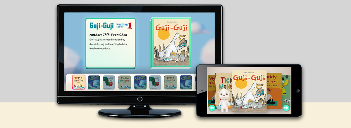
Read is a research project exploring the use of voice recognition in children's reading experiences on a connected TV platform
Team:
- Brentt Kasmiskie: Designer / Co-Producer
- Maoyang Li: Programmer / Co-Producer
- Wanyan Zheng: Programmer / 3D Artist
- Chuan Zhou: Programmer / UI Artist
- Mahardiansyah Kartika: Programmer
- Eric Tsai: Programmer / Designer
On this project I was lead designer and co-producer. My primary task was to maintain the project vision and communicate it to the team and stakeholders. I worked heavily on user experience through storyboarding and mockups. I was also in charge of character development for Bearic (our bear character who served as reading encouragement and motivation). In terms of production we divided it into internal and external roles. I acted as the external producer, for our purposes this meant being the point of contact for the team, communicating with the client, scheduling playtests, and keeping the development blog.
Goal
Read was a project sponsored by EA to explore the use of voice recognition in children’s reading experiences. We had several goals laid down by the client.
- Explore voice recognition for children.
- Create a reading experience which would encourage children to read sentences aloud.
- Use EA’s connected TV platform (Mobile devices connected to a TV).
My main focus was on the second and third points as the exploration of voice recognition was a programmer job. We chose to use existing children's stories as content because creating new stories would be a poor use of our time when we are only an experimental research project and not planning on coming to market. In our execution we based the second goal on the model of parents reading to their kids. Where the parent reads the majority of the text and asks their child to read one sentence.
Directing Attention Between Screens
Most of the experiences to be had on connected TV platforms involve the action taking place on the big screen and the mobile device being used as a controller with limited functionality. This means the player is not expected to engage with their mobile device, they aren’t supposed to look at it, in fact, most of the time it is a single button. We took a different approach. Since players are expected to read we wanted reading moments to take place on the tablet.
By having reading take place on the tablet we were able to improve our mic pickup rate because the player looked at the tablet while reading. It also meant that players would know when they were expected to interact. Along the way we faced some troubles, there wasn't an existing strategy that could be used to direct player attention between screens. Through development several rules were created which governed how content is depicted in multi-screen experiences to guide player attention. When followed, we saw from playtests that players would look at the appropriate screen at the appropriate times.
1. Feedback From Active Screen
Player feedback should only come from the screen the player is supposed to be looking at. Do not have any kind of feedback on the screen(s) the player is not supposed to be looking at. Sound and visual cues will draw attention to or from screens.
We made this mistake early in development. The player would be reading on the tablet. As they read we were checking their voice input for correctness and passing back whether a word was correct or not. If the word was correct it turned green on the TV and a ding sound was played. This was horrible. All of the reading feedback happened on the TV, but the player was looking at and reading from the tablet. This disrupted the reading process, we noticed players would always look up at the sound leading to a stuttering form of reading.
2. Vibration
Use vibration when the player is supposed to look at the tablet
When the player is supposed to look down at the tablet, vibrate it. Do not vibrate too frequently. It can be tempting to use vibration as feedback for player actions on the tablet. If you save vibration for the cue to switch screens, it becomes much more powerful at drawing attention away from the other screen.
3. Dim The Inactive Screen
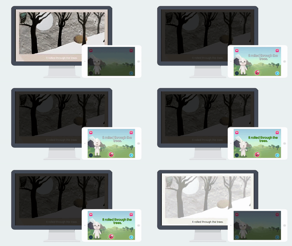
Dim the screen(s) you want players to look away from. This reassures them that nothing will happen on that screen. It is important that this is only a dimming and not blacking out the screen as it lets players know the experience is still happening and their TV or tablet did not lose power. Use the dimming in the whole experience, especially the very beginning. Establishing this visual cue early helps players know what screen to look at.
Good: Dim the screen the player should not look at. In this case the tablet dims.
BAD: Adding UI to point to the correct screen only served as a distraction for players.
When we first noticed the problem of attention between screens, we began to brain storm ways of directing attention. We quickly identified the feedback problem and solved it. However, in playtests it was clear that this was not enough. After some more testing we realized players were looking back and forth because they were afraid they would miss something. We needed a way to let players know that it was safe to look away from a screen, they needed to trust us. Once we came to this conclusion, the jump to dimming inactive screens to communicate the pausing of content on said screen was not too far off. However, there was some concern that this would not be enough. To communicate which screen to look at better it was thought that we should add a UI element pointing to the correct screen from the inactive one. We put a giant hand on the inactive screen. It completely backfired, everyone thought it was a button. We watched as kids missed the whole story to poked at it on their tablets. We removed the UI and it worked fairly well. Players began looking at the correct screen.
4. Pass Objects Between Screens
The most interesting way we found to direct the player’s attention between screens was to pass objects from one screen to another.
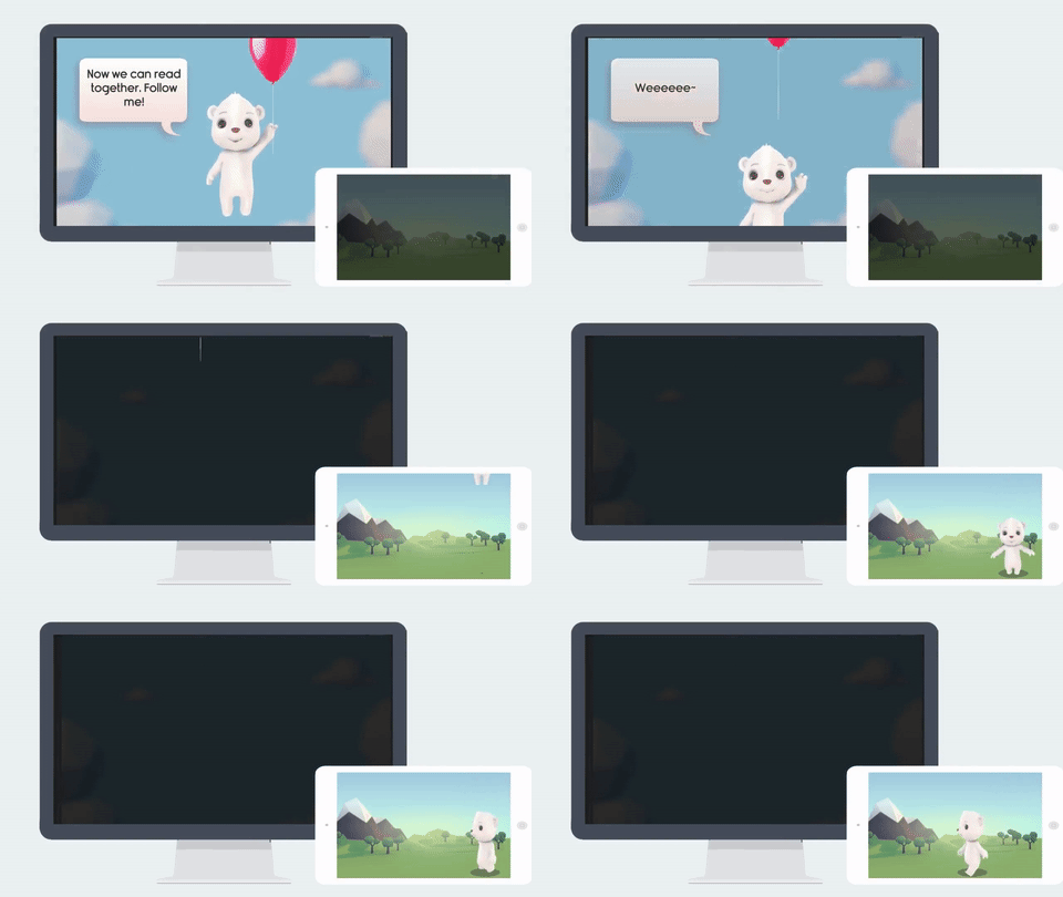
We started the experience passing Bearic, our bear character, from one screen to another because it was a cute idea which could give an early moment of joy and surprise. As we got further into the screen attention problem, we noticed that when Bearic passed from one screen to the other, the player's attention would follow. We started passing words between the screens and it worked really well. We did go through a few iterations of this though. The main take away, is the speed of the passing object is important. It needs to be fast enough to not become boring, but it also needs to be slow enough for players to follow. The true magic of passing object, specifically words for us, and dimming didn't come about until we united them. The screen dims, the words fall into the tablet (leaving a shadow of themselves behind). The player reads the words on their tablet. The words fly up into the TV back into their space. Then the screen turns on again. It makes the player feel as though their reading and the words they said were the magical key that activates the screen and story.
Bearic Moving between screens
Passing words between screens


